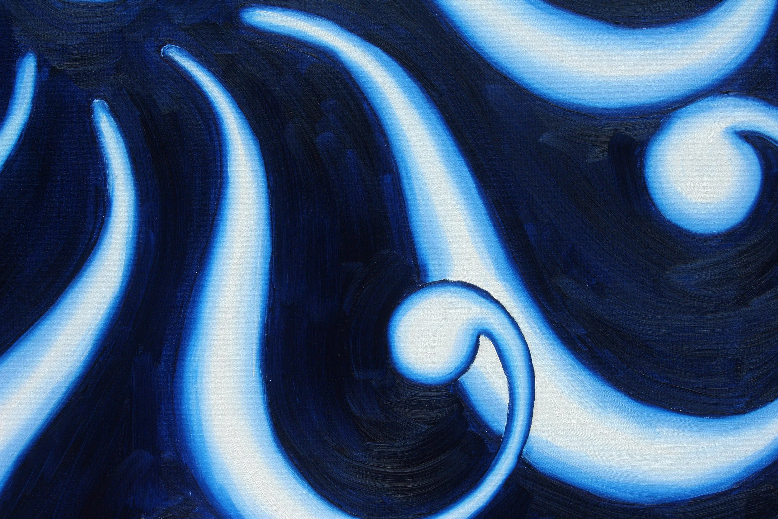
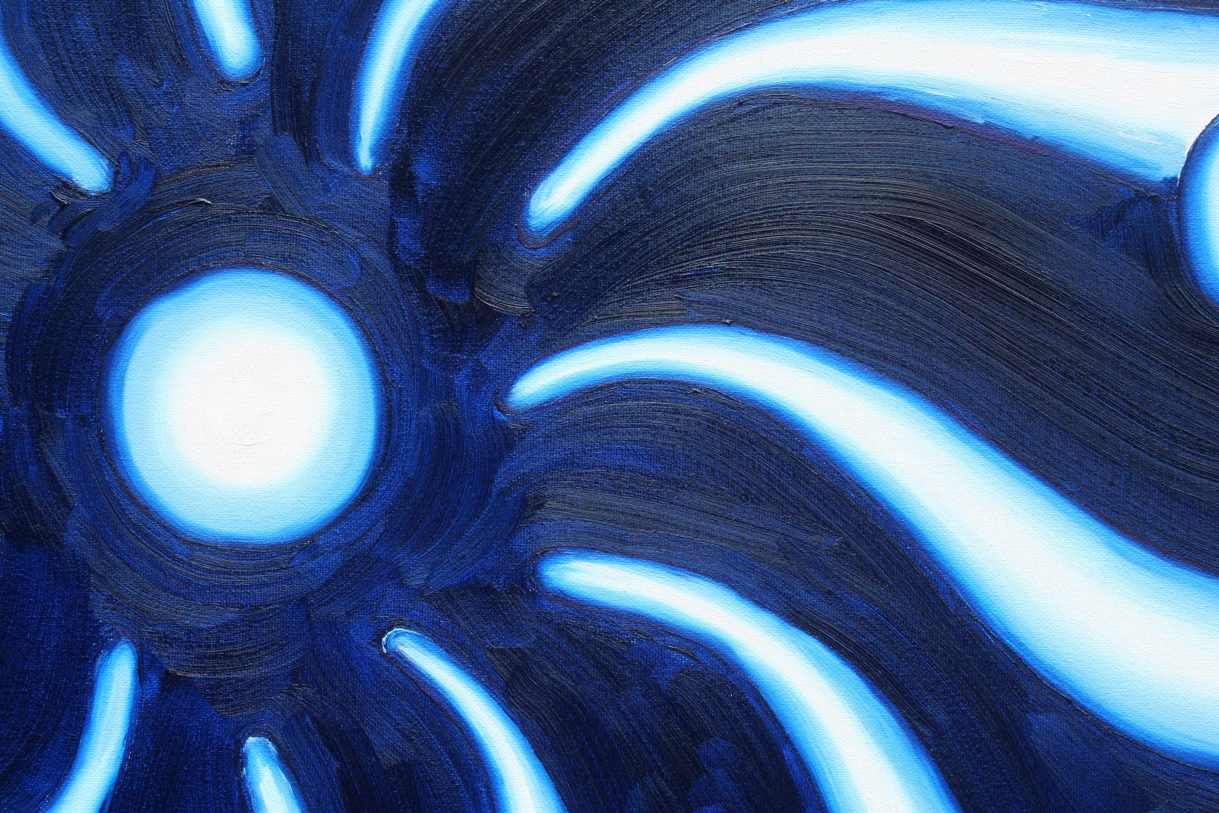
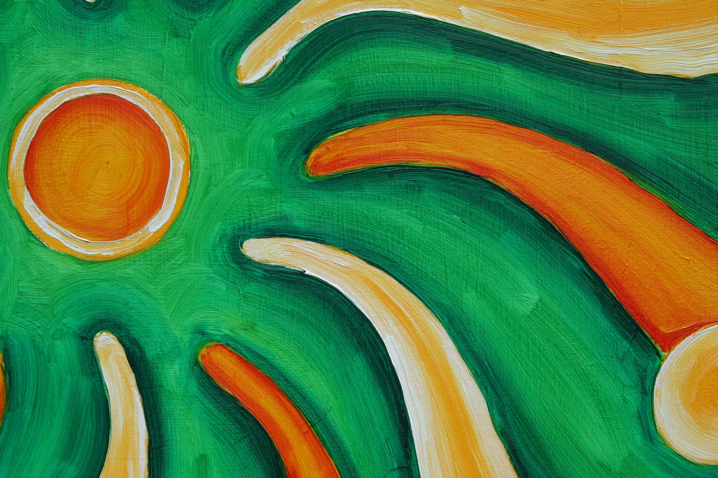
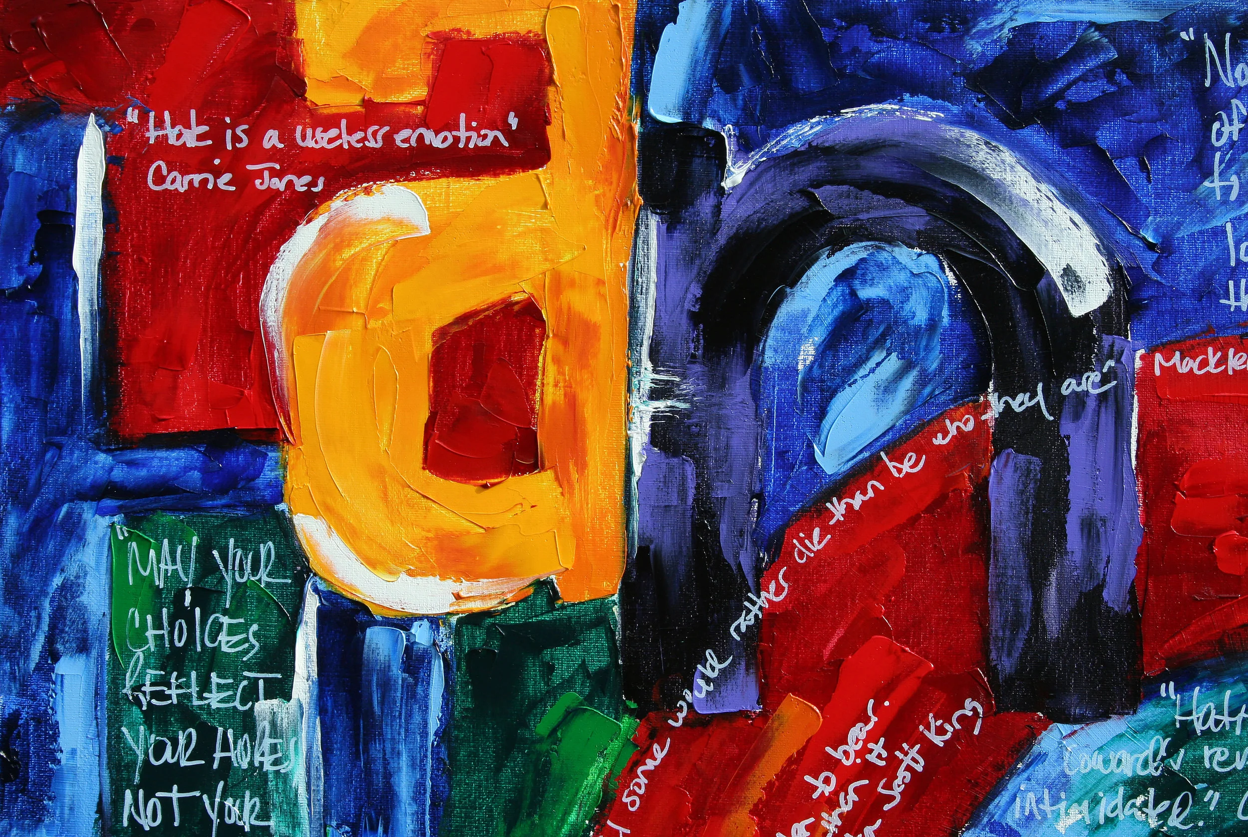
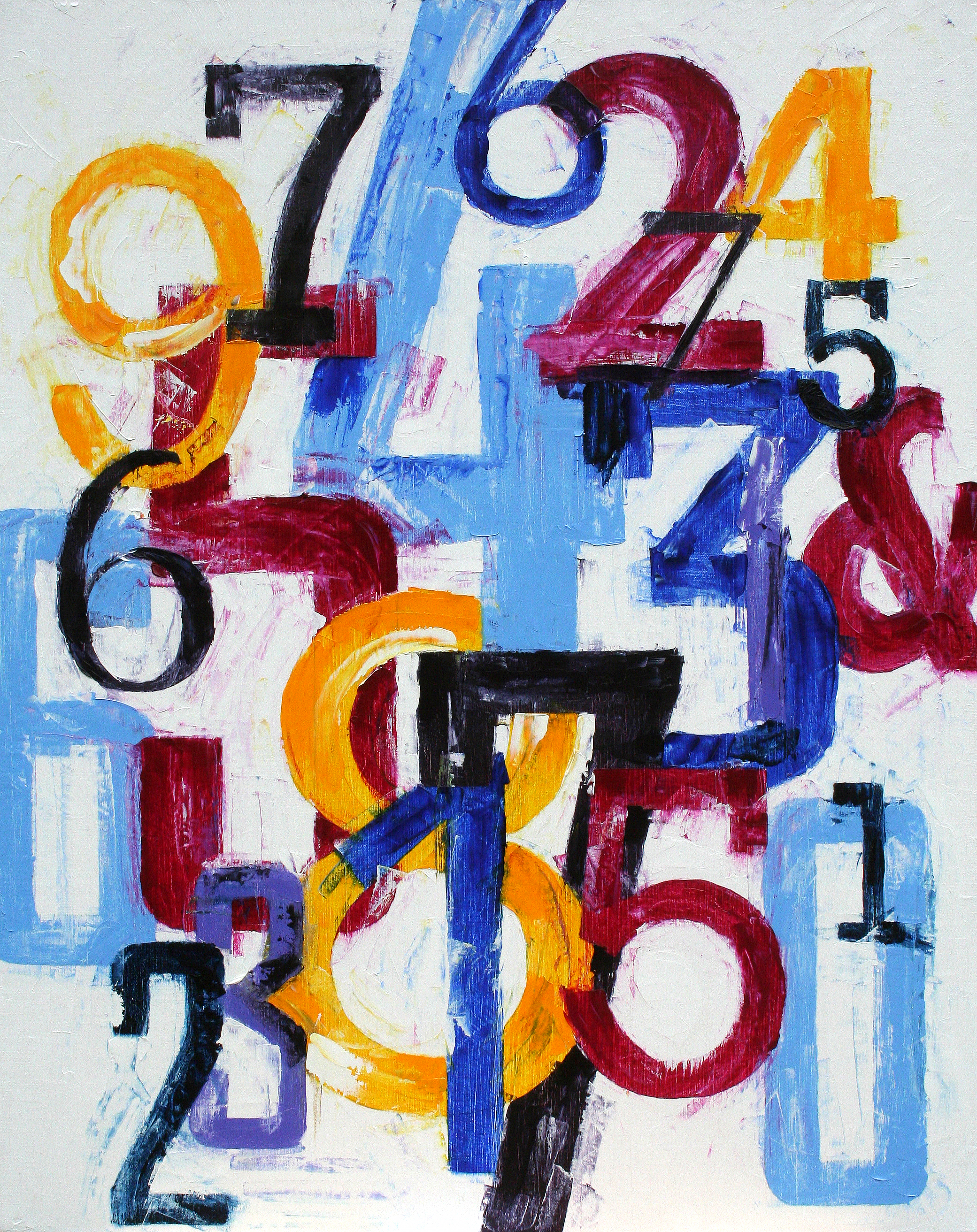
My latest works are influenced by my profession. As a designer, I’ve always had a love of typography. Type and color connect us all. They are a constant in everyone's lives and yet we each have different associations with them. Blue may make you think of the sky but for me, it could be a scarf my grandmother wore when I was a child. Certain letters or numbers have specific meanings to us–our initials or our lucky numbers, etc. My interest is in exposing what we see every day in a big, bold and new way.
20"x20
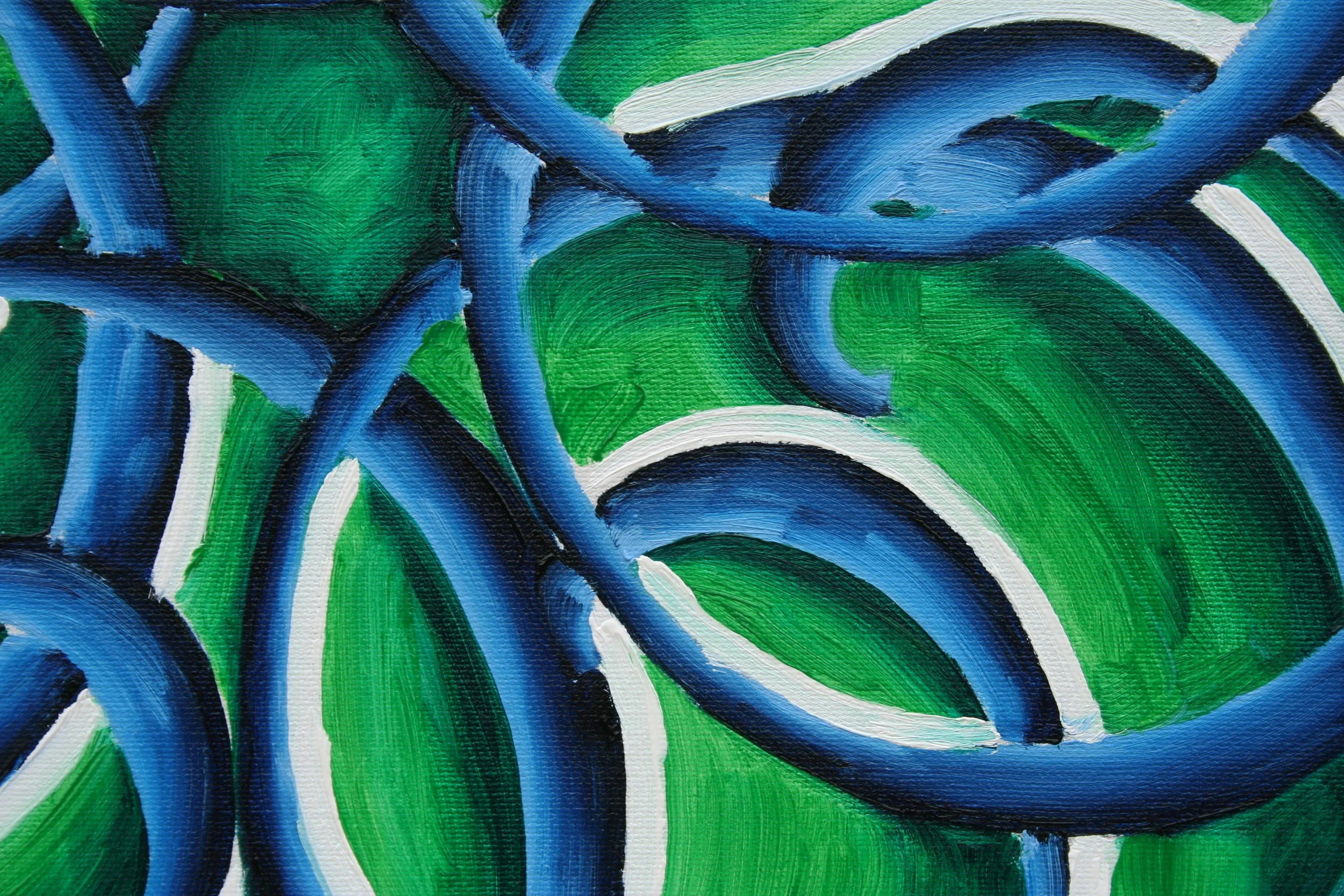
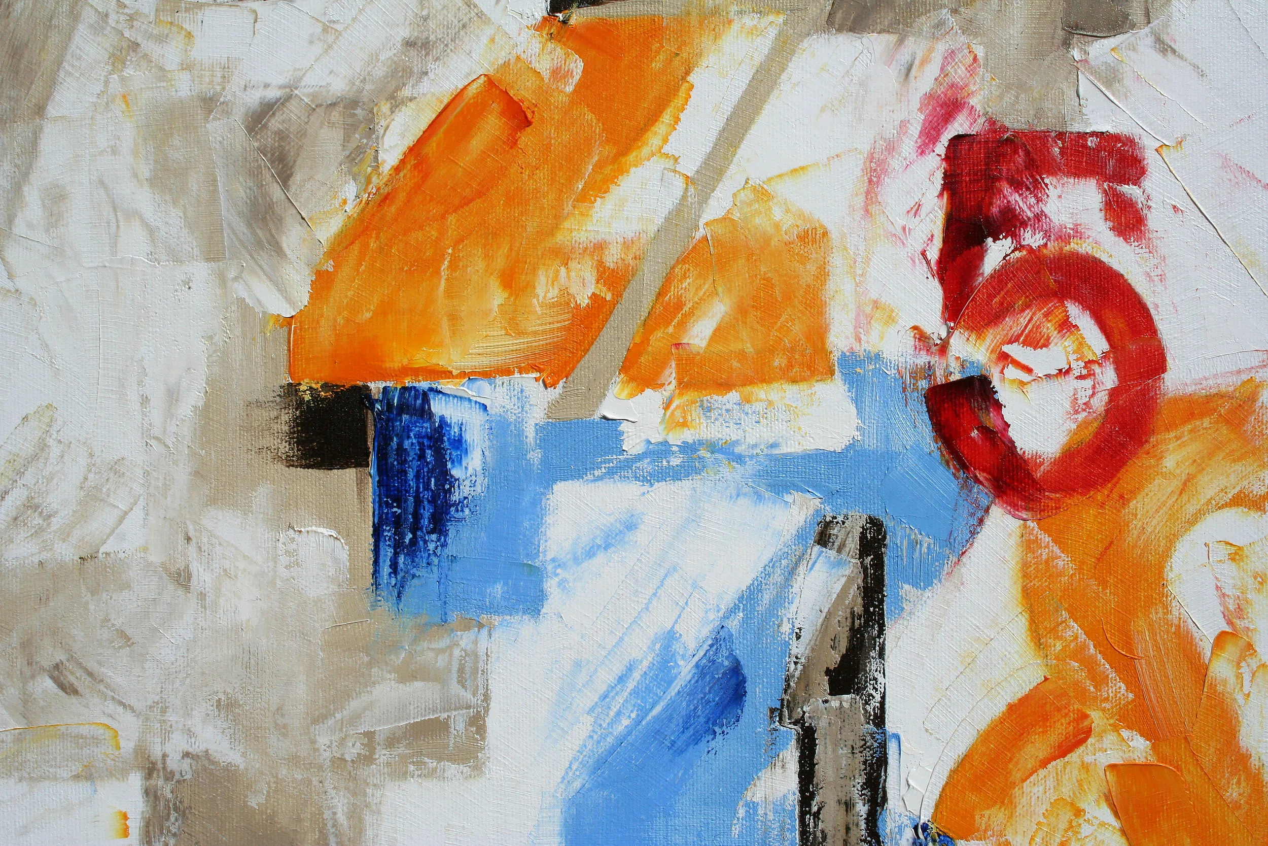
The ampersand is one of the most unique typographical characters out there.
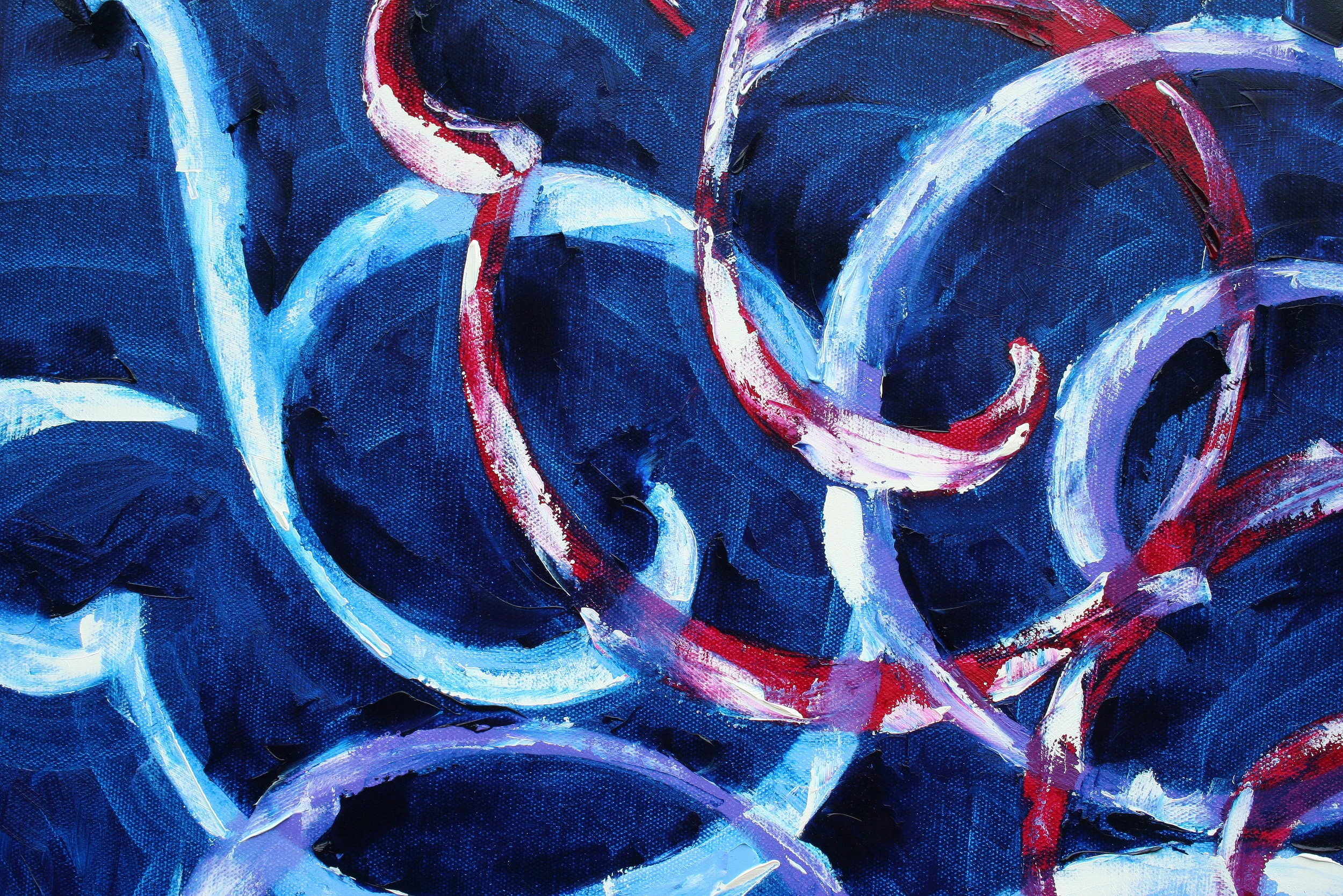
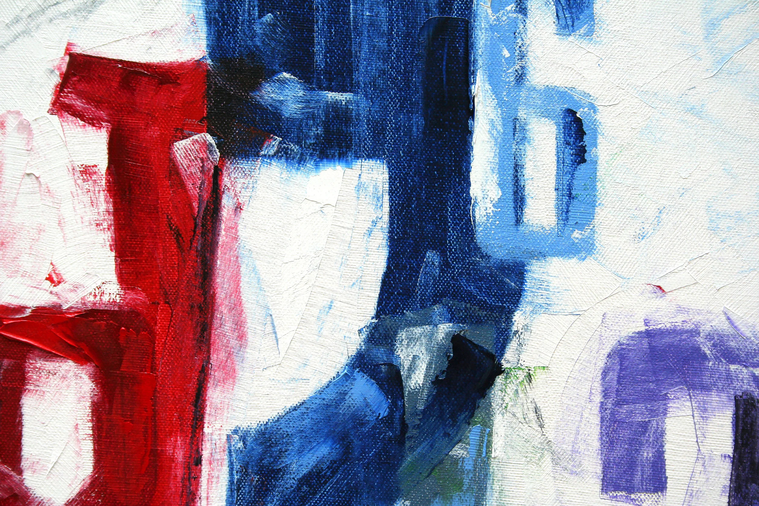
University Roman is based on Speedball hand-lettering. Designed at the Letraset Type Studio in 1983. University Roman is notable for its narrow capitals with crossbars that sit well above the median line. This unique roman design evokes a romantic air in display work such as packaging and advertising.
24"x24"
University Roman is based on Speedball hand-lettering. Designed at the Letraset Type Studio in 1983. University Roman is notable for its narrow capitals with crossbars that sit well above the median line. This unique roman design evokes a romantic air in display work such as packaging and advertising.
24"x30"
12"x12"
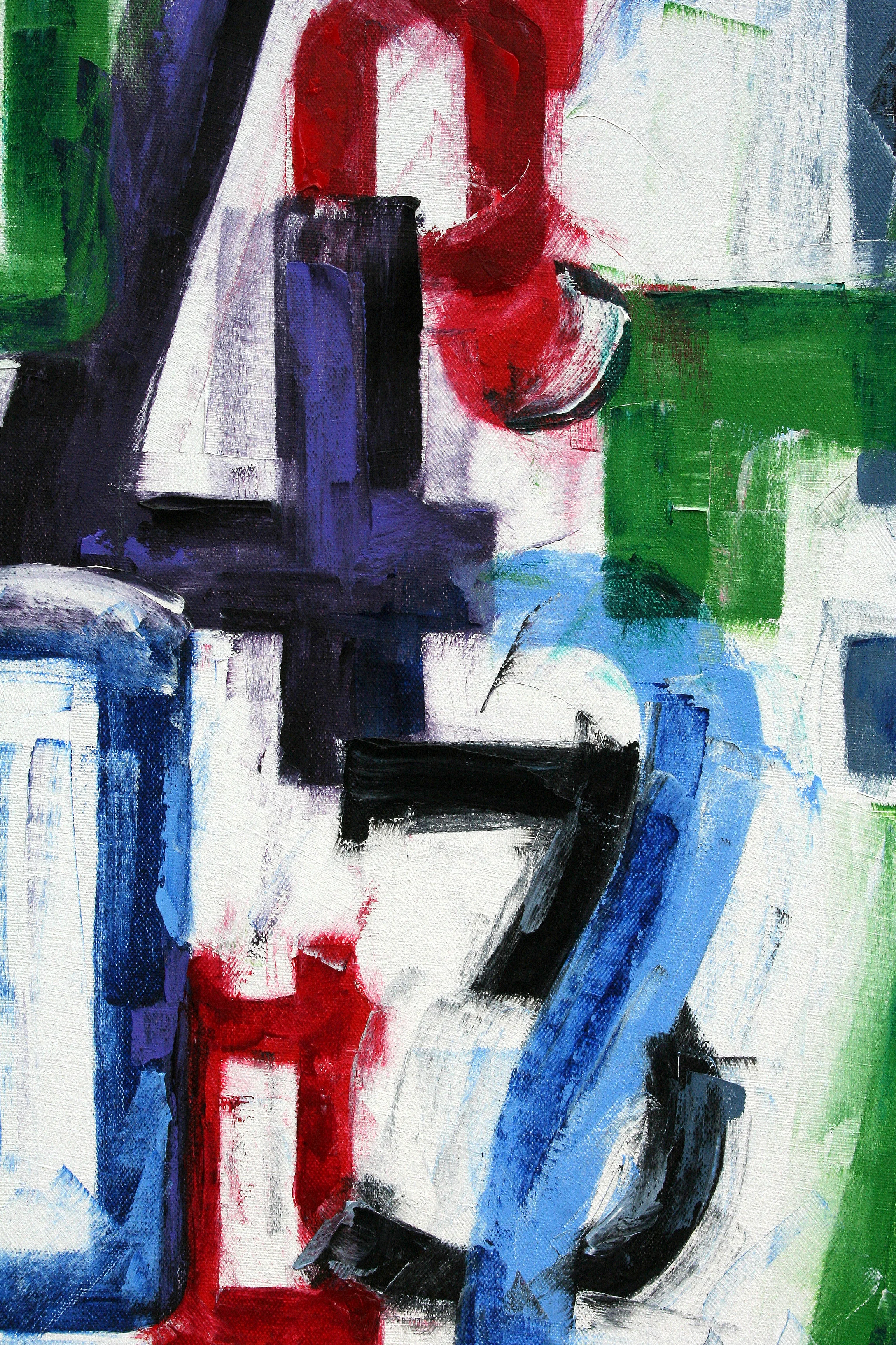
Goudy is a classic old-style serif typeface originally created by Frederic W. Goudy for American Type Founders (ATF) in 1915.
Suitable for both text and display applications, Goudy is a graceful, balanced design with a few eccentricities, including the upward-curved ear on the g and the diamond shape of the dots of the i, j, and the points found in the period, colon and exclamation point, and the sharply canted hyphen. The uppercase italic Q has a strong calligraphic quality. Generally classified as a Garalde (sometimes called Aldine) face, certain of its attributes—most notably the gently curved, rounded serifs of certain glyphs—suggest a Venetian influence. The design is relatively light in colour, and has been described as particularly suitable for titles and headings.
Goudy Catalog was introduced in 1919 and designed as a medium weight companions.
24"x30"
24"x30"
30"x30"
24"x30"
24"x30"
24"x30"
16"x16"
20"x20"
30"x30"
24"x30"